

Michael Torosian:
Unlimited Vistas for a Limited Edition Press
By Emily Morrison
Light Impressions Review, 1987
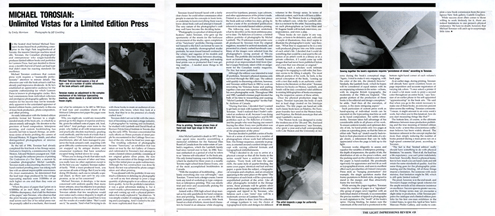
In the heated shed behind Michael Torosian’s home-based book publishing enterprise in the High Park neighbourhood of Toronto, the massive Intertype machine stood idle. Torosian, the Canadian photographer and entrepreneur who single-handedly produces limited edition books and portfolios for Lumiere Press, had just decided to throw away a month’s harvest of hand-cast lead type that didn’t meet his exacting standards for excellence.
Michael Torosian confesses that custom press work requires a “maniacally perfectionistic” attention to minute details. His obsessive care with the book artisan’s craft has already paid impressive dividends. At 34, he’s established an appreciative audience for the exquisite craftsmanship for which Lumiere Press is known in photographic circles. He’s had commissions from individual collectors and prestigious photographic galleries. Yet the reasons for his success may not be immediately apparent to the uninitiated appraiser of limited edition books, particularly in this era of mass book production, photo composition, and offset printing.
An early infatuation with the limited edition portfolio format led Torosian to a single-minded study of the book arts, in which he is almost entirely self-taught. His devotion to the precision of hand composition, letterpress printing, and custom bookbinding has recently led him to launch Homage, an ambitious series of books profiling the careers of Edward Weston, W.Eugene Smith, and other distinguished photographers of international repute.
By the fall of 1986, Torosian had already completed the first book in his Homage series, Dedicated to Simplicity, a reminiscence by Cole Weston, Edward Weston’s youngest son. Half-way through the arduous process of printing The Confessions of a Tree Taster, a memoir by Canadian photographer Michel Lambeth, Torosian made a disconcerting discovery. The hand-cranked proofing press was inking each line with an almost imperceptible unevenness. On closer examination, he determined that the lead type slugs produced by his vintage typecasting machine were 3/1000ths of an inch higher on one end than they were on the other.
“When the piece of paper that I print on is 6/1000ths of an inch thick, and there’s a 3/1000ths discrepancy, that’s half the thickness of the paper,” says Torosian, who observed that the print became progressively darker as he read across each line of his initial press run. He promptly called in a mechanic, then tossed out what he estimates to be 400 to 500 lines of lead type and countless sheets of the Mohawk Letterpress text paper the pages were printed on.
Why, you might ask, would any reasonable person go to this degree of expense and trouble, given the inflated costs of paper, ink, lead, and labour? And perhaps even more to the point , why bother at all with temperamental and practically obsolete machinery, grueling work methods, and the tools of a trade that is virtually extinct? Only a handful of scattered practitioners, after all, have managed to preserve the book artisan’s craft, acquiring with great difficulty cumbersome type cabinets not yet snapped up by antique dealers, and ornamental typefaces that have somehow escaped being melted down for scrap.
“When you’re doing a book that takes such an extraordinary amount of labour and time, you really have no other aspiration except to do the best you can”, explains Torosian matter-of-factly. ”With a mass-produced book, you can excuse all sorts of things. But if you’re only doing 150 (books), each one is virtually a special object, so there just can’t be any compromise, as far as I’m concerned.”
Michael Torosian, it develops, is far more concerned with uniform quality than many lesser artisans, since his objective is to produce an object that stands as a work of art in itself. Torosian admits that few neophytes would ever notice such a minor disparity in depth of impression as the one that caused him to toss out the results of a week’s labor. “But I could see it”, he asserts. “And what I’m trying to do with these books is create an audience of connoisseurs who know, when they look at a book, that they’re in the presence of a finely crafted item”.
Torosian didn’t set out in life with the intention of becoming a one-man cottage industry. A photographer by training and inclination, he studied with Lambeth and David Heath at Ryerson Polytechnical Institute in Toronto during the early 1970s. Torosian concentrated his early efforts on 35mm portraits of street people he encountered in the Cabbagetown section of the city where he lived ten years ago.
The resulting collection of photographs became Sanctuary, an exhibition that was taken on tour by the Art Gallery of Ontario and culminated in Torosian’s first attempt to create a limited edition portfolio, consisting of ten original gelatin silver prints. He now regards the execution of the design and binding for his initial piece as quite rudimentary. Although the box construction was done by hand, the text was achieved by photo composition and offset printing.
“I was pleased with the portfolio; it was very much a milestone in defining my photography – as well as my first attempt to print a large quantity of photographs in an edition of uniform quality. As for the portfolio’s execution, it was a great adventure making it, but it wasn’t exactly a phenomenon of taking a concept and coming up with a physical presentation that really explored it”, he observes. “It was simply a matter of coming up with a housing and a packaging. And I wanted to be a little more sophisticated than that.”
“Torosian found himself faced with a fairly clear choice: he could either commission other people to execute his concepts in book form, or undertake to learn everything there was to know about book craft and attempt it himself. The very nature of the photographer’s craft may well have become the deciding factor.
“Photography is a product of delayed gratification,” states Torosian, who gave up the spontaneity of the streets for the hothouse environment of the studio, upon completion of his Sanctuary portfolio. Having committed himself to the 6 x 4.5 cm format he uses in making his carefully choreographed studio portraits, he soon found himself confined to the whims and vagaries of his models and subjects. “The time delay between shooting, processing, contacting, proofing, and making final prints was so protracted that I was getting restless … I needed more things to fill my time.”
After Michel Lambeth’s death in 1977, Torosian spent nine months assembling a memorial exhibition for the National Film Board of Canada from the entire estate of Lambeth negatives, which the Lambeth family had since turned over to him. In 1980, Torosian embarked on a period of what he refers to as “intense self-education” in the book arts. His only formal training was in bookbinding, which he studied for three years in a nearby Toronto night school from Emrys Evans, one of the most accomplished bookbinders in Canada.
“With the exception of bookbinding, absolutely everything else was self-taught”, says Torosian. “I never took a design course; I never took any kind of workshop in type composition or letterpress printing. This was strictly trial and error and occasionally picking the mind of a veteran.”
Armed with a 1926 high school shop manual as his only guidebook for hand composition and printing, Torosian set out to print Lunarglyphics, an eccentric little book based on a font of forlorn, moon-faced characters he found in an almanac while shopping around for typefaces, presses, type cabinets, and other appurtenances of the printer’s trade. Printed in an edition of 50 on his first press, the book sold out within two days, giving its author a taste of the accelerated gratification inherent in successful limited edition printing.
The following year, Torosian undertook what he describes as his most ambitious project to date: The Reflection of Existence, a limited edition portfolio of photographs by Michel Lambeth. The 15 selenium-toned prints were all produced by Torosian from the original negatives, mounted to archival standards, and presented in a finely crafted handmade case. Many of the images were selected from the photographer’s roving portrait of 50s-era Toronto. The portfolio also includes Lambeth’s most acclaimed image, the brutally honest portrait of an impoverished child from Quebec’s Gaspe Peninsula, taken while on assignment for the Canadian weekly magazine, The Star Weekly, but never published.
Although the edition was intended to total 25 portfolios, Torosian’s physical stamina only survived through the 16th copy. The edition sold quickly to discerning collectors, however, and Torosian settled back in 1983 to work on renovating his Victorian home and putting together a ten-year retrospective exhibition of his own work. Throughout 1984 and 1985, Lambeth’s former pupil devoted the bulk of his time to researching and curating Michel Lambeth: Photographer for the Public Archives of Canada.
“During that time, I decided that I wanted to get back on track with Lumiere Press”, recalls Torosian. “And I realized that I hadn’t cultivated an audience at all, because I was doing little $10 books like Lunarglyphics and $1,500 portfolios such as The Reflection of Existence, and the people who were buying one weren’t buying the other. Every new publication was a new event; there was no sense of continuity, of the progression of the press”.
Torosian decided to publish a series of books born of a sense of reverence for a number of photographers whose work had influenced him. His Homage series, currently in progress, is oriented around a unified design concept with varying editorial formats and typographical embellishments.
“What I decided to do was to arrive at a physical concept so that all the books in the series would have a uniform style”, he explains. “Every book will have the same cloth, the same style of quarter-binding, the same cover paper, identical endleaf and text paper, a quote from the subject, a biographical synopsis and colophon, and an ornament appearing in the same place on the spine”. The frontispiece of each book will be a previously unpublished portrait of the artist. Like all other photographs included in the Homage series, these portraits will be gelatin silver prints made from copy negatives of the artists’ originals and tipped in by Torosian, who believes such a rare “extra” may well be a trademark service of Lumiere Press.
Torosian plans to draw from his collection of vintage typefaces to vary the choice of typographical styles and designs for different volumes in the Homage series. In terms of editorial content, each book will have a different format. The Weston book is a biography by the subject’s son, while the Lambeth edition is a memoir by the artist. Succeeding titles on such photographers as Lewis Hine and W.Eugene Smith will include interviews, correspondence, and even a play.
“These books do not aspire in any way, shape or form to be definitive, and, with only a couple of illustrations, they don’t aspire to illustrate the photographer’s work”, says Torosian. “What they’re supposed to be is a very well-produced glimpse into one little corner of each artist’s life. I decided that I could do something that would be a real asset to the collection of an artist’s work in a library or in a private collection, if I could come up with images that had never been published before and a text that was obscure or original.”
Making such a scholarly work intimate enough to be engaging is a tall order, but Torosian seems to be filling it adeptly. The most difficult portion of his work, he feels, is the actual conception of the book, “coming up with a text that really is an authentic contribution to the literature on that artist.” Torosian believes his books on Weston, Lambeth, and Smith will be duly considered valid additions to existing bibliographies of books encompassing the respective careers of these artists.
Once the physical production stage has begun, Torosian typecasts the body of each text in lead slugs created on his Intertype machine. The title pages are hand-set with such classic book faces as Palatino, the European foundry face used in the Weston book, and Perpetua, the British Monotype that sets apart Lambeth’s memoir.
“The Weston book was designed to evoke the modern era of the 20s and 30s, that kind of spare and lean appearance,” says Torosian, who spent a year-and-a-half corresponding with Cole Weston and the University of Arizona during the book’s conceptual stage. “Again, I tried to make it very engaging, with the colour of the ink, the (muted) browns.” Similarly, the Lambeth book - which he hopes will be considered of equal stature with its accompanying volumes in the series - echoes, with its singular British typography, the modernity of the 1940s-era England. “The greater portion of the production of these books is the editorial and design conception,” he adds. “And then all the execution, of course, is the more intriguing aspect.”
Such particulars of custom press work as hand-spacing of individual words can be executed on the typecasting machine as well as by hand composition. For subtle refinements, Torosian takes full advantage of his considerable skills in all phases of his work. To ensure uniform tonality and optimum density of ink, he hand-prints only two pages at a time on a proofing press, so that the lines on either side “back up” (match exactly back-to-back in their placement on both sides of a single sheet), a refinement that can be fully appreciated when the page is held up to the light.
Torosian works diligently to assess and equalize the variables of letterpress printing - the depth of impression, the quality of ink, the distribution of ink on the press’s rollers, and the packing used on the cylinders over which the paper is hand-cranked. He proofreads rigorously for appearance and text fit as well as typographical errors, and uses to excellent effect such peculiarities of Oxford University Press style as “hanging punctuation” (for example, the single quotation marks that frame quotations in British style, designed to stand in the margin and thus attractively frame the text block).
While sewing the pages together, Torosian varies the number of pages in a “signature” (the group of pages sewn together with an individual strand of thread), to accommodate the precise number of tipped-in photographs in each signature to the “swell” of the book’s spine. During binding, he makes sure the watermark of the endleaf is positioned in the bottom right-hand corner of each volume’s back page.
At an earlier stage, during printing, Torosian will already have spent countless hours on page imposition and accurate registration of varying ink colours. “I once asked a printer if it wasn’t a lot more work to print a second colour throughout an entire book,” says Torosian of an earlier phase in his self-appointed “apprenticeship” in the book arts. “He said that when you go to the extent necessary to make one of these books, an extra ten percent labour seems like nothing,” Torosian comments. “I mean, it might amount to an extra week’s work, but when you’re this fanatical, how do you start measuring things like that?”
The bottom line, of course, is the ultimate difference between mass-production publishing and the true meaning of limited edition book work - a term this conscientious craftsman believes has been widely abused. The limitation inherent in the concept implies far more than simply reducing the number of books printed during a mass press run on a high-speed commercial press, according to Torosian.
“The fact is that ‘limited edition’ really should have something to do with physical limitation,” he asserts. “First of all, the lead has a life expectancy; you can’t print indefinitely from lead. Secondly, there’s a physical limitation to how much you can hand-crank and still retain the same standards of quality. And the same thing goes for the photographic printmaking and the binding. All of these things impose a limitation. For someone with more stamina, that limitation might be 300, which is still quite limited indeed.”
The proof, however, is in the end result, and Torosian’s happy endings speak volumes for the ample rewards of his obsessive insistence on excellence. Success spawns greater success, and the Homage series may yet encounter a slight delay in production, while Torosian prepares the catalogue and a limited edition portfolio for his first one-man exhibition in the United States, to open this April at New York’s Marcuse Pfeifer Gallery, and works to complete a new book commission from the prestigious Leo Castelli Gallery in New York.
While success most often comes to those willing to work tirelessly for it, there are indeed limitations to one person’s physical endurance. We have no doubt, however, that Michael Torosian will catch up in surprisingly little time.
Unlimited Vistas for a Limited Edition Press
By Emily Morrison
Light Impressions Review, 1987
In the heated shed behind Michael Torosian’s home-based book publishing enterprise in the High Park neighbourhood of Toronto, the massive Intertype machine stood idle. Torosian, the Canadian photographer and entrepreneur who single-handedly produces limited edition books and portfolios for Lumiere Press, had just decided to throw away a month’s harvest of hand-cast lead type that didn’t meet his exacting standards for excellence.
Michael Torosian confesses that custom press work requires a “maniacally perfectionistic” attention to minute details. His obsessive care with the book artisan’s craft has already paid impressive dividends. At 34, he’s established an appreciative audience for the exquisite craftsmanship for which Lumiere Press is known in photographic circles. He’s had commissions from individual collectors and prestigious photographic galleries. Yet the reasons for his success may not be immediately apparent to the uninitiated appraiser of limited edition books, particularly in this era of mass book production, photo composition, and offset printing.
An early infatuation with the limited edition portfolio format led Torosian to a single-minded study of the book arts, in which he is almost entirely self-taught. His devotion to the precision of hand composition, letterpress printing, and custom bookbinding has recently led him to launch Homage, an ambitious series of books profiling the careers of Edward Weston, W.Eugene Smith, and other distinguished photographers of international repute.
By the fall of 1986, Torosian had already completed the first book in his Homage series, Dedicated to Simplicity, a reminiscence by Cole Weston, Edward Weston’s youngest son. Half-way through the arduous process of printing The Confessions of a Tree Taster, a memoir by Canadian photographer Michel Lambeth, Torosian made a disconcerting discovery. The hand-cranked proofing press was inking each line with an almost imperceptible unevenness. On closer examination, he determined that the lead type slugs produced by his vintage typecasting machine were 3/1000ths of an inch higher on one end than they were on the other.
“When the piece of paper that I print on is 6/1000ths of an inch thick, and there’s a 3/1000ths discrepancy, that’s half the thickness of the paper,” says Torosian, who observed that the print became progressively darker as he read across each line of his initial press run. He promptly called in a mechanic, then tossed out what he estimates to be 400 to 500 lines of lead type and countless sheets of the Mohawk Letterpress text paper the pages were printed on.
Why, you might ask, would any reasonable person go to this degree of expense and trouble, given the inflated costs of paper, ink, lead, and labour? And perhaps even more to the point , why bother at all with temperamental and practically obsolete machinery, grueling work methods, and the tools of a trade that is virtually extinct? Only a handful of scattered practitioners, after all, have managed to preserve the book artisan’s craft, acquiring with great difficulty cumbersome type cabinets not yet snapped up by antique dealers, and ornamental typefaces that have somehow escaped being melted down for scrap.
“When you’re doing a book that takes such an extraordinary amount of labour and time, you really have no other aspiration except to do the best you can”, explains Torosian matter-of-factly. ”With a mass-produced book, you can excuse all sorts of things. But if you’re only doing 150 (books), each one is virtually a special object, so there just can’t be any compromise, as far as I’m concerned.”
Michael Torosian, it develops, is far more concerned with uniform quality than many lesser artisans, since his objective is to produce an object that stands as a work of art in itself. Torosian admits that few neophytes would ever notice such a minor disparity in depth of impression as the one that caused him to toss out the results of a week’s labor. “But I could see it”, he asserts. “And what I’m trying to do with these books is create an audience of connoisseurs who know, when they look at a book, that they’re in the presence of a finely crafted item”.
Torosian didn’t set out in life with the intention of becoming a one-man cottage industry. A photographer by training and inclination, he studied with Lambeth and David Heath at Ryerson Polytechnical Institute in Toronto during the early 1970s. Torosian concentrated his early efforts on 35mm portraits of street people he encountered in the Cabbagetown section of the city where he lived ten years ago.
The resulting collection of photographs became Sanctuary, an exhibition that was taken on tour by the Art Gallery of Ontario and culminated in Torosian’s first attempt to create a limited edition portfolio, consisting of ten original gelatin silver prints. He now regards the execution of the design and binding for his initial piece as quite rudimentary. Although the box construction was done by hand, the text was achieved by photo composition and offset printing.
“I was pleased with the portfolio; it was very much a milestone in defining my photography – as well as my first attempt to print a large quantity of photographs in an edition of uniform quality. As for the portfolio’s execution, it was a great adventure making it, but it wasn’t exactly a phenomenon of taking a concept and coming up with a physical presentation that really explored it”, he observes. “It was simply a matter of coming up with a housing and a packaging. And I wanted to be a little more sophisticated than that.”
“Torosian found himself faced with a fairly clear choice: he could either commission other people to execute his concepts in book form, or undertake to learn everything there was to know about book craft and attempt it himself. The very nature of the photographer’s craft may well have become the deciding factor.
“Photography is a product of delayed gratification,” states Torosian, who gave up the spontaneity of the streets for the hothouse environment of the studio, upon completion of his Sanctuary portfolio. Having committed himself to the 6 x 4.5 cm format he uses in making his carefully choreographed studio portraits, he soon found himself confined to the whims and vagaries of his models and subjects. “The time delay between shooting, processing, contacting, proofing, and making final prints was so protracted that I was getting restless … I needed more things to fill my time.”
After Michel Lambeth’s death in 1977, Torosian spent nine months assembling a memorial exhibition for the National Film Board of Canada from the entire estate of Lambeth negatives, which the Lambeth family had since turned over to him. In 1980, Torosian embarked on a period of what he refers to as “intense self-education” in the book arts. His only formal training was in bookbinding, which he studied for three years in a nearby Toronto night school from Emrys Evans, one of the most accomplished bookbinders in Canada.
“With the exception of bookbinding, absolutely everything else was self-taught”, says Torosian. “I never took a design course; I never took any kind of workshop in type composition or letterpress printing. This was strictly trial and error and occasionally picking the mind of a veteran.”
Armed with a 1926 high school shop manual as his only guidebook for hand composition and printing, Torosian set out to print Lunarglyphics, an eccentric little book based on a font of forlorn, moon-faced characters he found in an almanac while shopping around for typefaces, presses, type cabinets, and other appurtenances of the printer’s trade. Printed in an edition of 50 on his first press, the book sold out within two days, giving its author a taste of the accelerated gratification inherent in successful limited edition printing.
The following year, Torosian undertook what he describes as his most ambitious project to date: The Reflection of Existence, a limited edition portfolio of photographs by Michel Lambeth. The 15 selenium-toned prints were all produced by Torosian from the original negatives, mounted to archival standards, and presented in a finely crafted handmade case. Many of the images were selected from the photographer’s roving portrait of 50s-era Toronto. The portfolio also includes Lambeth’s most acclaimed image, the brutally honest portrait of an impoverished child from Quebec’s Gaspe Peninsula, taken while on assignment for the Canadian weekly magazine, The Star Weekly, but never published.
Although the edition was intended to total 25 portfolios, Torosian’s physical stamina only survived through the 16th copy. The edition sold quickly to discerning collectors, however, and Torosian settled back in 1983 to work on renovating his Victorian home and putting together a ten-year retrospective exhibition of his own work. Throughout 1984 and 1985, Lambeth’s former pupil devoted the bulk of his time to researching and curating Michel Lambeth: Photographer for the Public Archives of Canada.
“During that time, I decided that I wanted to get back on track with Lumiere Press”, recalls Torosian. “And I realized that I hadn’t cultivated an audience at all, because I was doing little $10 books like Lunarglyphics and $1,500 portfolios such as The Reflection of Existence, and the people who were buying one weren’t buying the other. Every new publication was a new event; there was no sense of continuity, of the progression of the press”.
Torosian decided to publish a series of books born of a sense of reverence for a number of photographers whose work had influenced him. His Homage series, currently in progress, is oriented around a unified design concept with varying editorial formats and typographical embellishments.
“What I decided to do was to arrive at a physical concept so that all the books in the series would have a uniform style”, he explains. “Every book will have the same cloth, the same style of quarter-binding, the same cover paper, identical endleaf and text paper, a quote from the subject, a biographical synopsis and colophon, and an ornament appearing in the same place on the spine”. The frontispiece of each book will be a previously unpublished portrait of the artist. Like all other photographs included in the Homage series, these portraits will be gelatin silver prints made from copy negatives of the artists’ originals and tipped in by Torosian, who believes such a rare “extra” may well be a trademark service of Lumiere Press.
Torosian plans to draw from his collection of vintage typefaces to vary the choice of typographical styles and designs for different volumes in the Homage series. In terms of editorial content, each book will have a different format. The Weston book is a biography by the subject’s son, while the Lambeth edition is a memoir by the artist. Succeeding titles on such photographers as Lewis Hine and W.Eugene Smith will include interviews, correspondence, and even a play.
“These books do not aspire in any way, shape or form to be definitive, and, with only a couple of illustrations, they don’t aspire to illustrate the photographer’s work”, says Torosian. “What they’re supposed to be is a very well-produced glimpse into one little corner of each artist’s life. I decided that I could do something that would be a real asset to the collection of an artist’s work in a library or in a private collection, if I could come up with images that had never been published before and a text that was obscure or original.”
Making such a scholarly work intimate enough to be engaging is a tall order, but Torosian seems to be filling it adeptly. The most difficult portion of his work, he feels, is the actual conception of the book, “coming up with a text that really is an authentic contribution to the literature on that artist.” Torosian believes his books on Weston, Lambeth, and Smith will be duly considered valid additions to existing bibliographies of books encompassing the respective careers of these artists.
Once the physical production stage has begun, Torosian typecasts the body of each text in lead slugs created on his Intertype machine. The title pages are hand-set with such classic book faces as Palatino, the European foundry face used in the Weston book, and Perpetua, the British Monotype that sets apart Lambeth’s memoir.
“The Weston book was designed to evoke the modern era of the 20s and 30s, that kind of spare and lean appearance,” says Torosian, who spent a year-and-a-half corresponding with Cole Weston and the University of Arizona during the book’s conceptual stage. “Again, I tried to make it very engaging, with the colour of the ink, the (muted) browns.” Similarly, the Lambeth book - which he hopes will be considered of equal stature with its accompanying volumes in the series - echoes, with its singular British typography, the modernity of the 1940s-era England. “The greater portion of the production of these books is the editorial and design conception,” he adds. “And then all the execution, of course, is the more intriguing aspect.”
Such particulars of custom press work as hand-spacing of individual words can be executed on the typecasting machine as well as by hand composition. For subtle refinements, Torosian takes full advantage of his considerable skills in all phases of his work. To ensure uniform tonality and optimum density of ink, he hand-prints only two pages at a time on a proofing press, so that the lines on either side “back up” (match exactly back-to-back in their placement on both sides of a single sheet), a refinement that can be fully appreciated when the page is held up to the light.
Torosian works diligently to assess and equalize the variables of letterpress printing - the depth of impression, the quality of ink, the distribution of ink on the press’s rollers, and the packing used on the cylinders over which the paper is hand-cranked. He proofreads rigorously for appearance and text fit as well as typographical errors, and uses to excellent effect such peculiarities of Oxford University Press style as “hanging punctuation” (for example, the single quotation marks that frame quotations in British style, designed to stand in the margin and thus attractively frame the text block).
While sewing the pages together, Torosian varies the number of pages in a “signature” (the group of pages sewn together with an individual strand of thread), to accommodate the precise number of tipped-in photographs in each signature to the “swell” of the book’s spine. During binding, he makes sure the watermark of the endleaf is positioned in the bottom right-hand corner of each volume’s back page.
At an earlier stage, during printing, Torosian will already have spent countless hours on page imposition and accurate registration of varying ink colours. “I once asked a printer if it wasn’t a lot more work to print a second colour throughout an entire book,” says Torosian of an earlier phase in his self-appointed “apprenticeship” in the book arts. “He said that when you go to the extent necessary to make one of these books, an extra ten percent labour seems like nothing,” Torosian comments. “I mean, it might amount to an extra week’s work, but when you’re this fanatical, how do you start measuring things like that?”
The bottom line, of course, is the ultimate difference between mass-production publishing and the true meaning of limited edition book work - a term this conscientious craftsman believes has been widely abused. The limitation inherent in the concept implies far more than simply reducing the number of books printed during a mass press run on a high-speed commercial press, according to Torosian.
“The fact is that ‘limited edition’ really should have something to do with physical limitation,” he asserts. “First of all, the lead has a life expectancy; you can’t print indefinitely from lead. Secondly, there’s a physical limitation to how much you can hand-crank and still retain the same standards of quality. And the same thing goes for the photographic printmaking and the binding. All of these things impose a limitation. For someone with more stamina, that limitation might be 300, which is still quite limited indeed.”
The proof, however, is in the end result, and Torosian’s happy endings speak volumes for the ample rewards of his obsessive insistence on excellence. Success spawns greater success, and the Homage series may yet encounter a slight delay in production, while Torosian prepares the catalogue and a limited edition portfolio for his first one-man exhibition in the United States, to open this April at New York’s Marcuse Pfeifer Gallery, and works to complete a new book commission from the prestigious Leo Castelli Gallery in New York.
While success most often comes to those willing to work tirelessly for it, there are indeed limitations to one person’s physical endurance. We have no doubt, however, that Michael Torosian will catch up in surprisingly little time.