

By Doug Picklyk
Designedge Canada, 2013
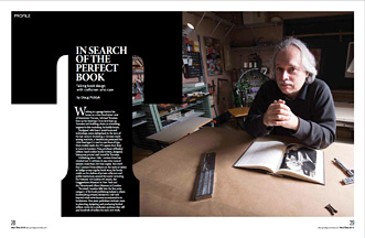
Working in a garage behind his house on a tree-lined street west of downtown Toronto, Michael Torosian fires up his Intertype C4 to let it heat up. Torosian isn’t building chairs or rebuilding engines in this workshop, he builds books.
Equipped with heavy metal tools and technology, some dating back to the turn of the last century (including a German-made sewing machine, a Vandercook press and the 1959 Intertype C4 used to cast lines of type from molten lead), the 375 square-foot shop is home to Lumiere Press, producer of limited edition hand-crafted books written, designed, letterpress printed and bound by Torosian.
Publishing since 1986, Lumiere Press has cranked out 22 editions in one-time runs of seldom more than 250 final copies. You won’t find Lumiere Press editions on the racks or tables at Indigo or any regular book store; his books reside on the shelves of private collectors and public institutions around the world including the National Gallery of Canada, the Guggenheim Museum in New York and the Victoria and Albert Museum in London.
Torosian’s vocation falls into the fine press category of the book publishing industry, where bookmaking artisans elevate the craft well beyond what we’ve become accustomed to in bookstores. Fine press publishers dedicate years to planning, designing and producing limited edition works for a dedicated audience that will pay hundreds of dollars for each new work.
Most fine presses in Canada work in relative anonymity, producing small edition literary works of poetry and short fiction. However, Torosian specializes in the photographic arts. He publishes his limited edition works specifically for a fine art audience and is commissioned by galleries or institutions to produce specific works. “I wanted a viable opportunity to work with the finest artists and galleries,” says Torosian, 60, explaining one of the reasons he started Lumiere Press.
Once the subject matter is selected for his next book, the research and writing stages set the foundation upon which the design process can begin. And while book design integrates many elements (paper selection, cover materials, book dimensions) the typography is the dominant component. “It is the syntax of the bookmaking process,” says Torosian. “It’s the foundation upon which the design is built.”
Selecting the typeface is paramount. “I can’t explain why I select different typefaces for different projects, but basically there is an appropriateness, a rightness, that seems to work. I always think this is too important to leave to analysis, this is something that I really believe has to be highly intuitive,” he says.
In his most recent work, Black Star—a story about three men in the publishing world who started out in Berlin, moved to New York and founded the Black Star photo agency in 1935—the typefaces in the book (Intertype Weiss and Linotype Memphis) happened to both be created by German type designer Emil Rudolph Weiss. “I have to tell you, that was just lucky coincidence,” says Torosian. “I would not have picked a typeface strictly on that basis. I selected the typeface because I had done trial pages in everything imaginable and this one just jumped out at me as having the right feel for the book.”
For Jason Dewinetz, owner of Greenboathouse Press, an independent fine press operation in Vernon, B.C., typeface selection is more intellectual than gut instinct. “I have found with most of the projects that I’ve done, the book kind of dictates what the typeface should be,” he says.
Dewinetz, 43, has a Masters in English Literature and teaches typography and bookmaking in the English department at Okanagan College in Vernon. He began digitally designing and printing books in 1999, and after studying typography and apprenticing on letterpress in the mid- 2000s he acquired the equipment to open his own shop in 2008. Greenboathouse Press focuses on contemporary Canadian poetry and books on typography. In 2012 Dewinetz released his eighth book, The First Principles of Typography, an essay by Stanley Morison first written in 1929.
“I really appreciated Morison’s tone, very British, stiff upper-lipped, quirky and demanding on how things should be done. I got a kick out of it,” says Dewinetz. The book is set in Romane?e, a face by Dutch type designer Jan van Krimpen who was a contemporary of Morison and also wrote a response to Morison’s First Principles essay. Dewinetz, a fan of van Krimpen’s fonts, selected the typeface to print Morison’s book and will also use it when he prints van Krimpen’s response this Spring as a companion piece.
Although possibly guided by different impulses, both of these fine press publishers agree the type on the page needs to work for the reader and with the book’s subject matter. “Book typography demands a very self-effacing, ego diminishing kind of approach,” says Dewinetz. It’s a distinction he makes between graphic design and book design. “In graphic design the entire intent is to get as much attention as possible, and the exact opposite impulse is necessary for book typography.”
“You’re supposed to read the text, you’re not supposed to see the page. So largely, the fine press printers I know are picking typefaces that are as non-descript as possible—well made and aesthetically beautiful, but not attention seeking.”
To print First Principles Dewinetz created a digital version of the typeface, set it digitally and had photopolymer plates created for printing the body text. After he began printing the book he sourced a metal version of the van Krimpen Romane?e face in Europe, so he was able to print select pages and elements in handset metal type as well.
In the fine press world, printing letterpress with polymer plates is a contentious issue, suggests Dewinetz. “There are a lot of fine press printers who say, if it’s not metal it’s not fine press.”
He understands the argument and actually much prefers setting metal type himself. “Once you know what you’re doing in [Adobe] InDesign, pretty much anyone can set pretty good type. Doing it in metal requires a lot more technical skill. First Principles is the only book I’ve done from polymer, and I don’t plan to do many others in polymer because I actually like setting type.”
After more than 25 years, Torosian still marvels at the entire letterpress printing process. “There is nothing like setting an entire book, character by character, to instill awe in you,” he says. “I’m authentically reverential towards the guys who designed these typefaces and matrices and figured out how to enable you to bang out type and put words on paper. The whole thing still amazes me.”
Each Lumiere Press book is printed letterpress using metal type and may include high-quality litho printed images or photographs hand-tipped onto the pages. The Black Star book is 90 pages, with all of the text set and printed in Torosian’s workspace with 46 litho images printed at C.J. Graphics in Toronto and incorporated throughout the book.
Andrew Steeves is the co-founder of Gaspereau Press in Kentville, Nova Scotia, a multi-award winning small press book publisher that prints with both letterpress and offset printing technologies. Not a traditional fine press operation, Gaspereau publishes first-run Canadian literature with open-ended runs. “We also do the occasional full-out letterpress limited editions—maybe one every few years, though we’re gearing up to increase the frequency,” says Steeves.
Gaspereau was founded in 1997 by Gary Dunfield and Steeves, and has carved out a niche in the contemporary trade publishing business by placing more emphasis on the design and art of the bookmaking process.
Commenting on the state of contemporary book design and typeface selection Steeves is blunt: “Most books today are made with type faces that are dull and clumsy by people whose use of them are equally dull and clumsy. This is needless, as never in the history of the book have there been so many good tools and resources available to the average typographer.
“The books I make employ typography in service of ideas. They are not intended to be pretty or to show off, but rather to successfully covey our culture’s ideas through time and space. In order to do that, the type has to be well made and well used, a robust tool like a hammer.
“I don’t design books to look at or possess only. I design them to be read. In the humanist tradition, a book functions as a sort improvised explosive device that must wait patiently, sometimes for generations, for its contents to trigger an explosion in a reader’s mind. The type is an important component of the IED’s circuitry.”
In this new era of digital type and high-speed printing technology, Torosian believes there is still work to be done to match the quality of the letterpress. Although most digital fonts used today are extracted from original metal typefaces he feels the cut of the faces and the weights have been compromised. “They haven’t taken into account how ink spreads within the fibres of the paper when you letterpress print it. So you get offset typography that looks rather hollow,” he says. “Letterpress printing literally is the most beautiful way of getting words on paper. I don’t think that’s debatable,” says Torosian
As for the state of book design, Torosian is closest to books in the art world and is not impressed with what he sees on the shelves. “It’s become sort of expected in the art world that a book on a contemporary artist has to have a sans-serif face, has to have a starkness, it has to have a kind of minimalist modernism, and they all look this way.
“There are museum bookstores I’ve been to where you can grab 25 books and you’d swear they were all designed by the same person. I think that is unbelievably tedious, and I don’t know why the artist doesn’t protest, except there is a kind of safety in conformity.”
As for the e-book, Torosian sees the growth of such technologies only increasing the value of the high-quality physical books he’s producing. He relates a quote attributed to Marshall McLuhan, “When a technology becomes obsolete, it becomes an art form.”
“And that’s what’s happened here,” says Torosian. “Once letterpress was no longer commercially viable as a printing process, everything moved to offset lithography and digital, and this process was looked at with new eyes.”
Both Dewinetz and Steeves teach students about typography, while both continue to be dedicated to learning and creating the best books possible themselves. Steeves offers these words to budding book designers: “A few basic concepts would fix many of the world’s typographic woes. Like remember to optically space all caps, especially in display. And treat a book’s elements as an organic whole–the indents, margins, gutters, leading, type size, line measure, text block and trim size must all hold some proportional relationship to each other, and to the reader who will inhabit the books pages. If the typographer keeps these things in mind, it will be easier to find his or her way.”
Dewinetz recognizes that there is plenty of room for him to keep improving his craft. “My technical abilities are constantly being challenged by my exposure to what other people have done,” he says.
An avid book collector himself, he studies great books. “It’s not a matter of wanting to copy or emulate them, it’s more a matter of wanting to get as technically good as these other people are.” He admires the fine press work of Russell Maret in New York. “He’s got an extremely precise and beautiful aesthetic in his style. So if I look at a book of his and I look at a book of mine, I see that I have a long way to go.”
He doesn’t feel extra pressure to create typographically-perfect books because he’s creating books on the topic of typography, he puts pressure on himself because he wants to make aesthetically beautiful and technically perfect books. “Which is impossible, but that’s always the goal,” he says.
For Torosian, he’s constantly challenging himself with every title he produces. “I don’t want to be self- indulgent and make books that nobody wants to acquire. I’m trying to participate in the worlds of photography and literature and do it to at as high a level as I can so other people authentically value it.
“I have a very simple equation,” says Torosian. “That is to put every book I make into the hands of an appreciative collector.”
Currently Lumiere Press has books in over 140 public collections, with standing orders from galleries, museums and institutions around the globe for books he has yet to produce. And all those orders will be fulfilled from a garage in the west end of Toronto.